01A clean, dimensional brand mark
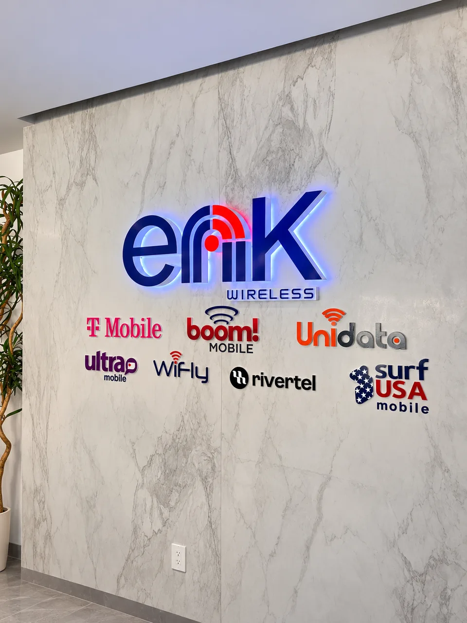
Dimensional logo & letters
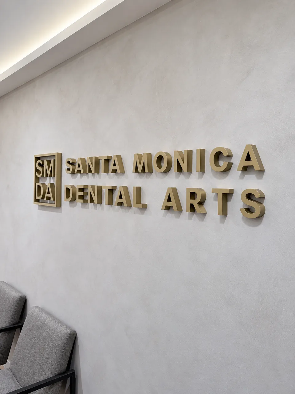
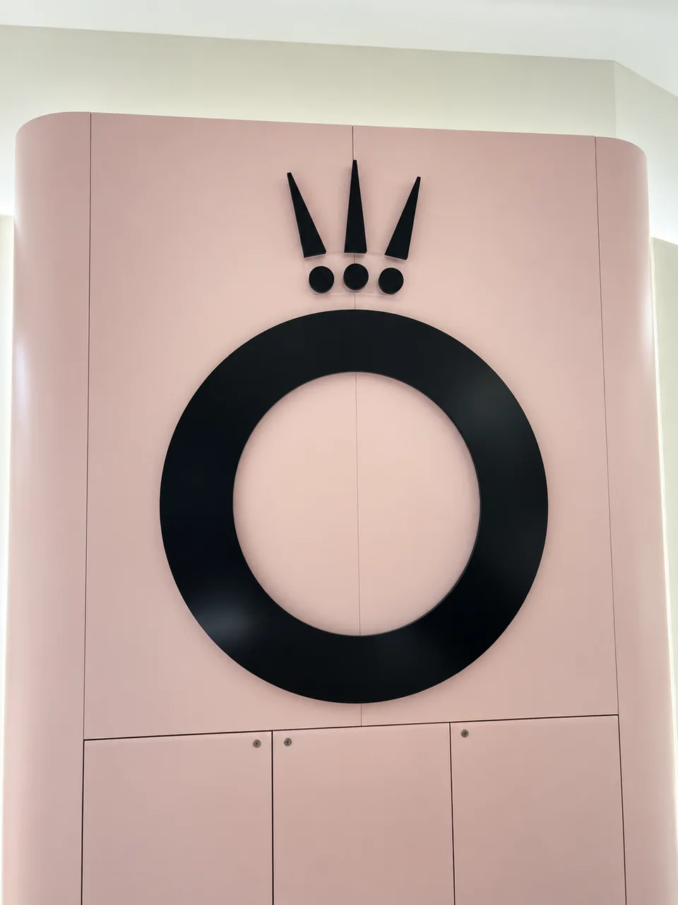
Individual letters or logo shapes add real depth and shadow. Specify acrylic, PVC, metal or layered constructions, with painted, brushed or polished finishes.

The first impression, inside
A lobby logo, directional system or tactile room sign should feel like it belongs in the space—and work for the people moving through it. We fabricate interior signage with the finish, mounting and use-case considered from the start.
Explore your optionsThe useful distinctions
From the reception wall to the room number, each sign has a different job. Choose a visual language and a construction that supports it.
Individual letters or logo shapes add real depth and shadow. Specify acrylic, PVC, metal or layered constructions, with painted, brushed or polished finishes.
The reception wall is often the first close-up view of your brand. We help size the logo for the wall, sightline and lighting, then plan a mounting approach that feels intentional.
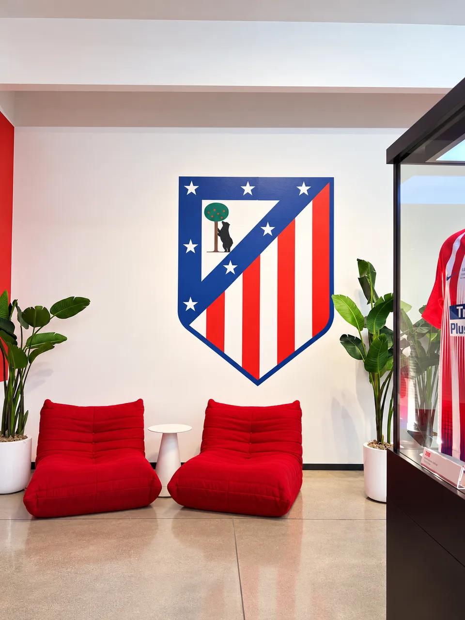
Directional signs help visitors make decisions without asking for help. Consistent arrows, terminology, contrast and placement make a system easy to scan across a building.
Project photo coming soon
Building directories, tenant panels and room identification keep information organized and easy to update. Panels can be designed around a changeable insert or a permanent layout.
Project photo coming soon
Permanent room and facility identification may require raised characters, Grade 2 Braille, visual contrast and specific mounting locations. Requirements depend on the sign's use and applicable code.
Project photo coming soon
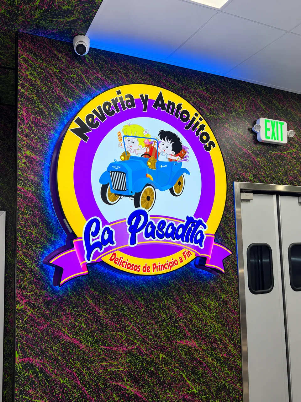
Halo-lit or face-lit elements can bring a logo to life at reception or in a feature space. Light color and output should complement the room—not compete with it.
Make it yours
The same artwork can read entirely differently in metal, acrylic or a layered build. These choices help a sign feel at home in your environment.
Acrylic gives a crisp, versatile color range; PVC is a practical painted dimensional option; aluminum and stainless steel bring a more architectural edge. Combinations add depth.
Choose painted color, brushed metal, polished metal, satin, matte or a printed face. Sheen changes how a sign catches light and how clearly it reads from across a room.
Flush-mounted letters sit close to the wall; stud mounts create a floating shadow; spacers create a consistent stand-off. A backer panel can simplify alignment and conceal attachment points.
Tactile character profile, Braille placement, contrast, pictograms and installation height all matter. We can discuss a compliant layout based on the sign's location and purpose.
From our shop to the street
A few projects from the BiK Signs portfolio. Each one starts with a different space, brand and set of constraints.
A real conversation beats a guess
Share a photo of the wall or a plan of the space. We can help shape a sign system that looks right and makes the building easier to use.